DABAR
BRANDING TYPOGRAPHY
CRAFT PUBLICATION DESIGN
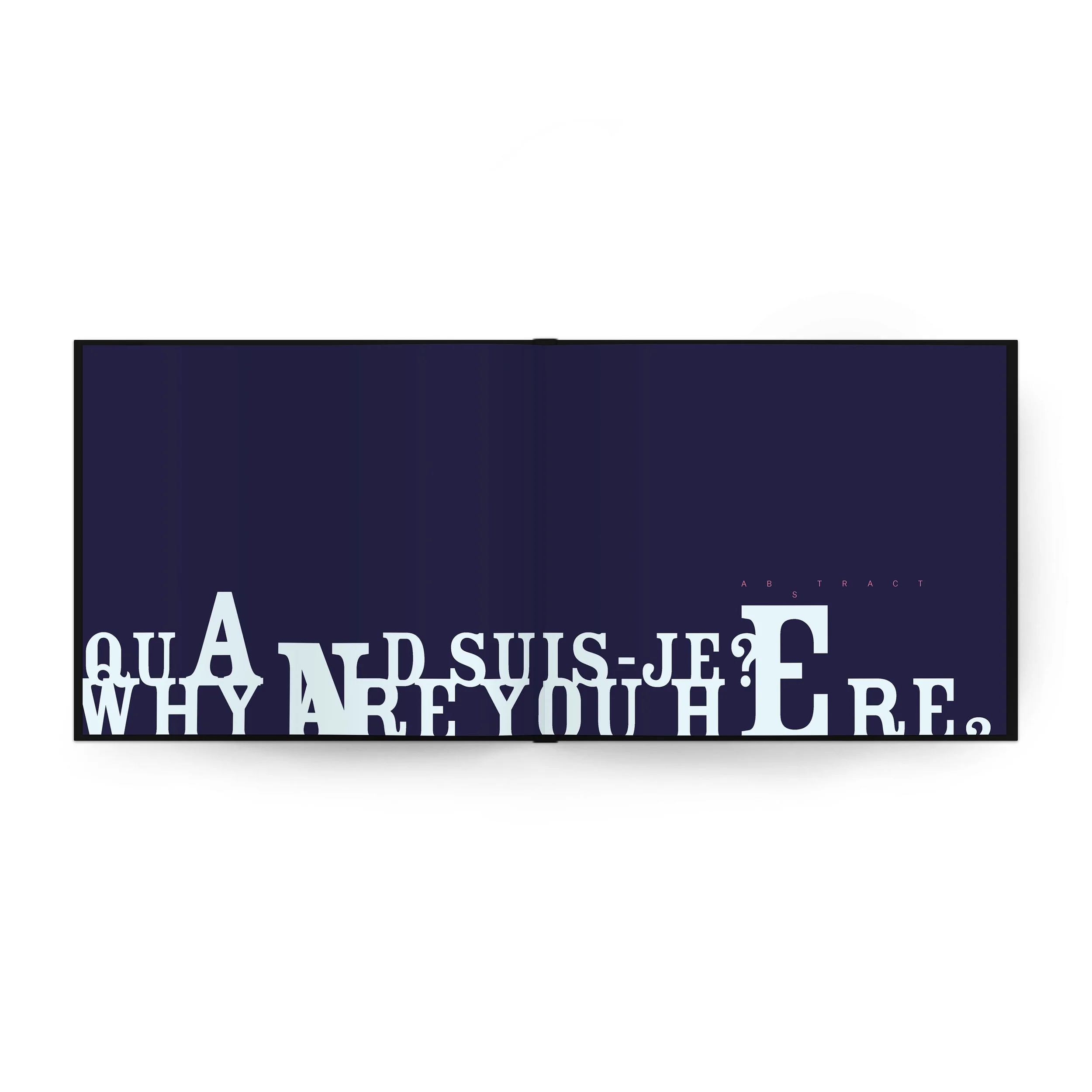
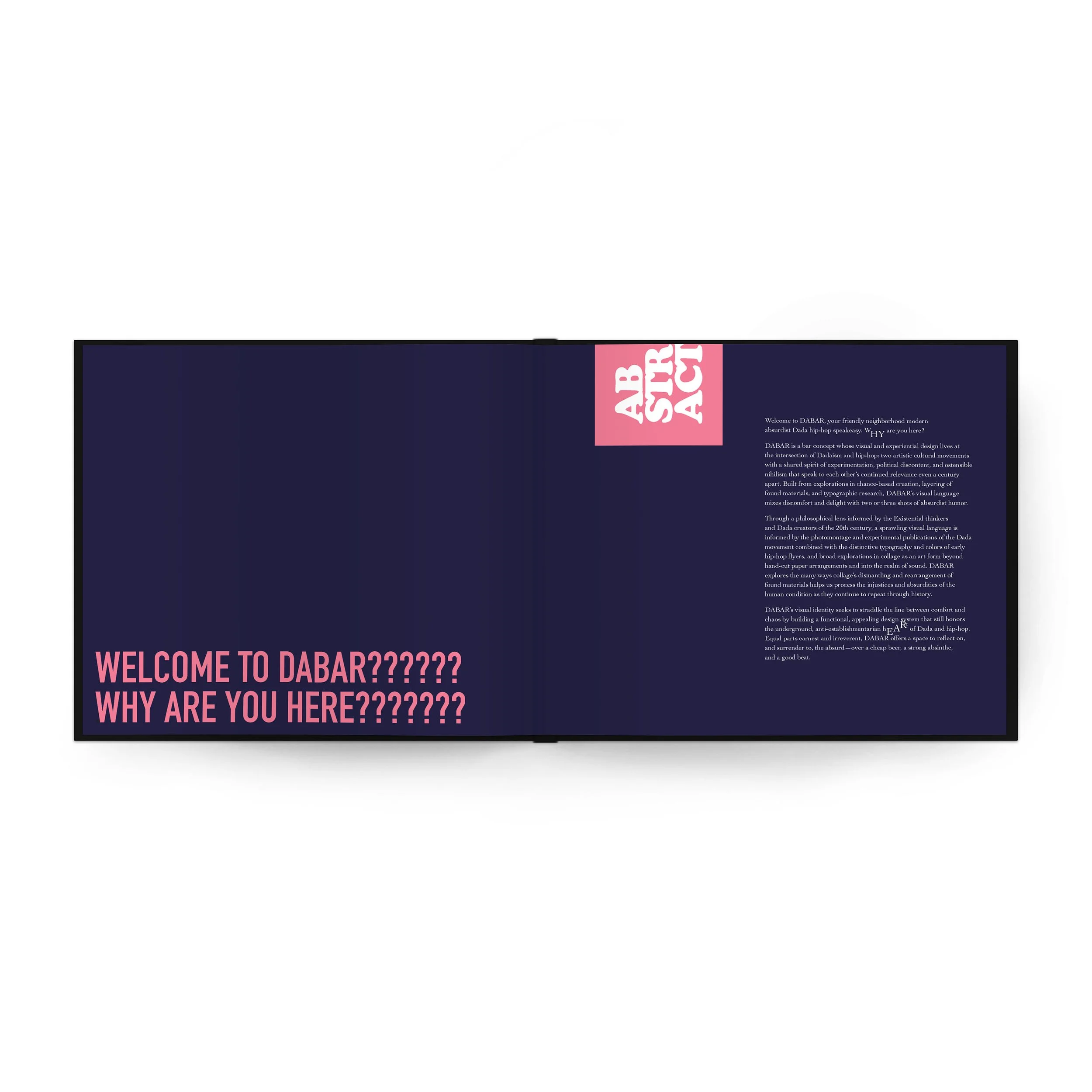
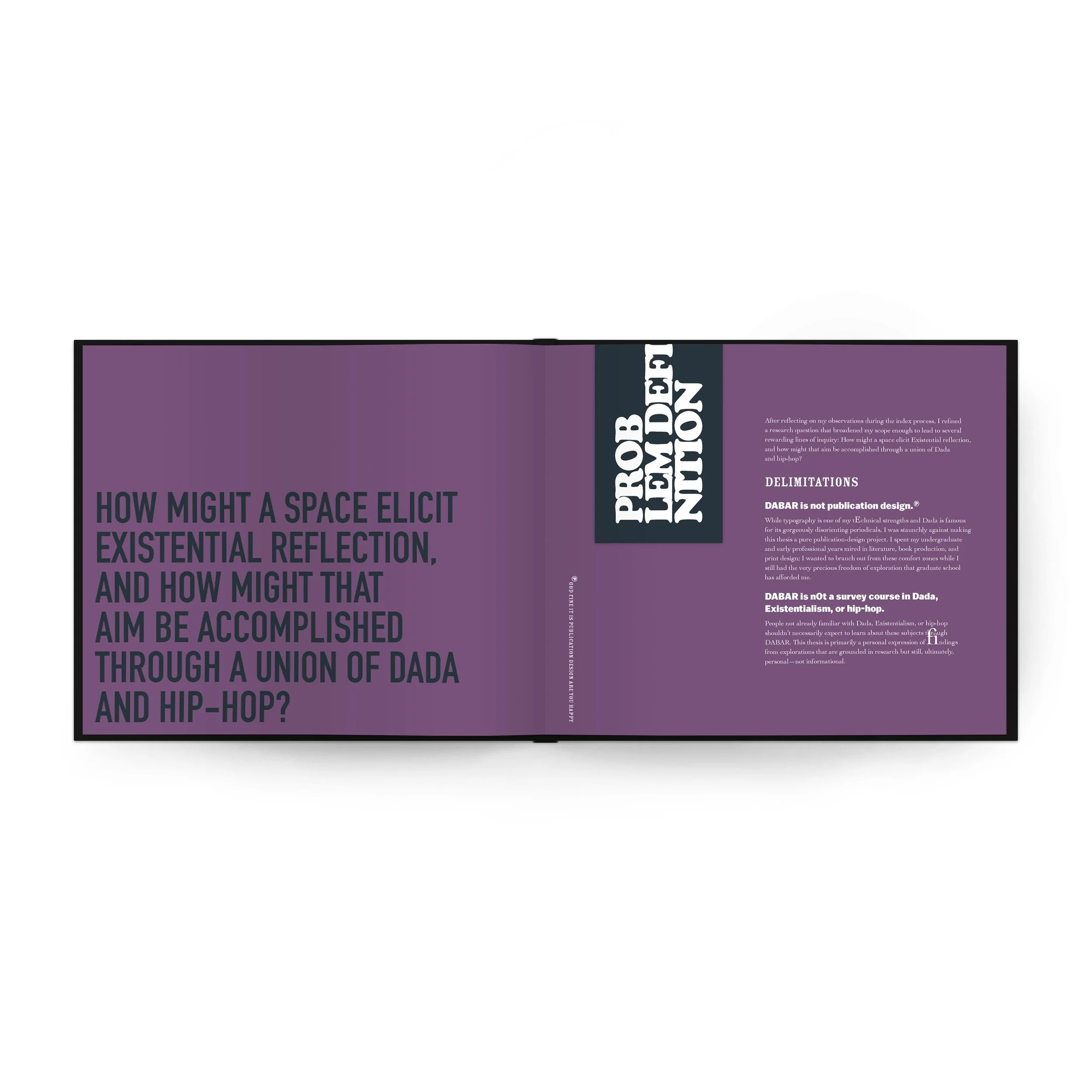
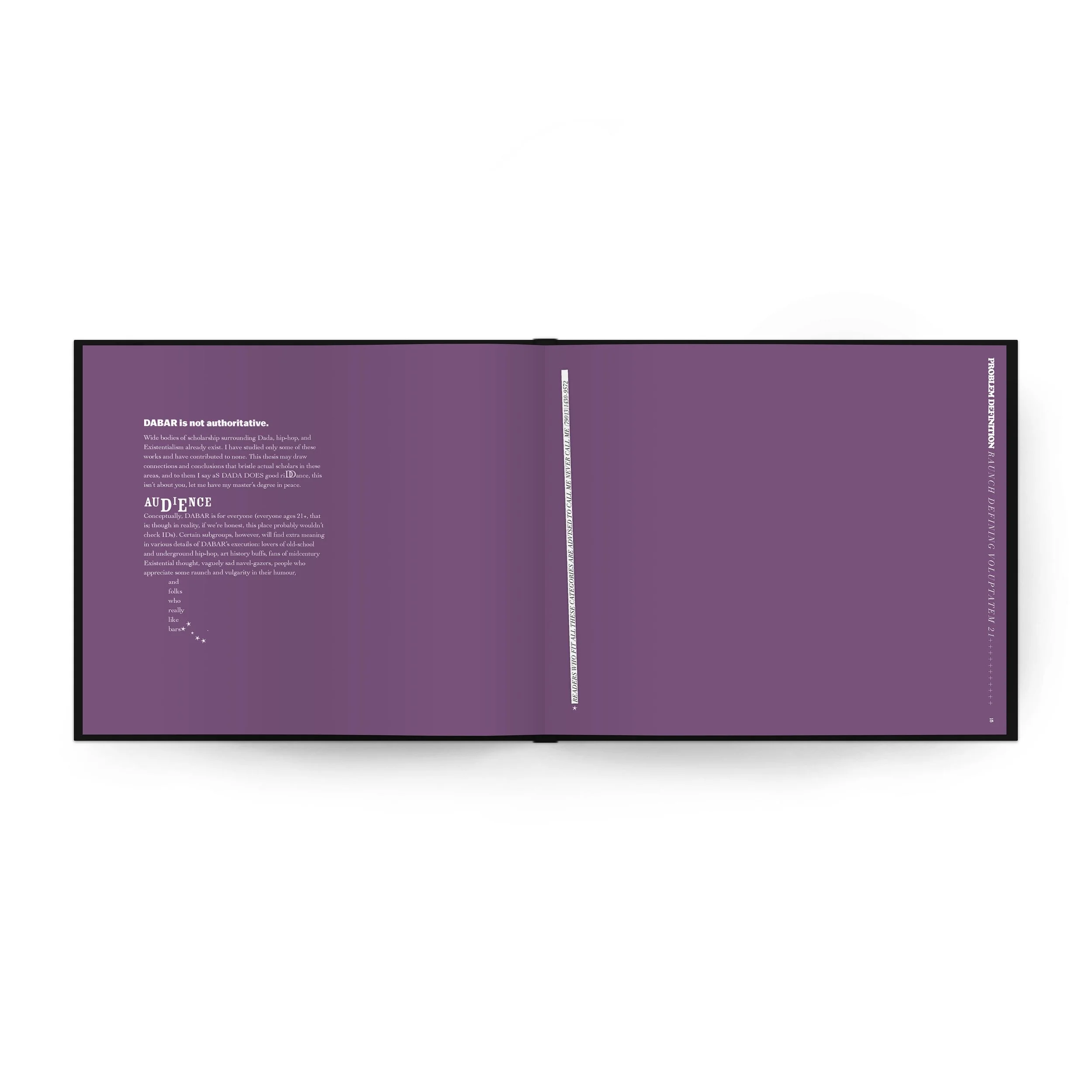
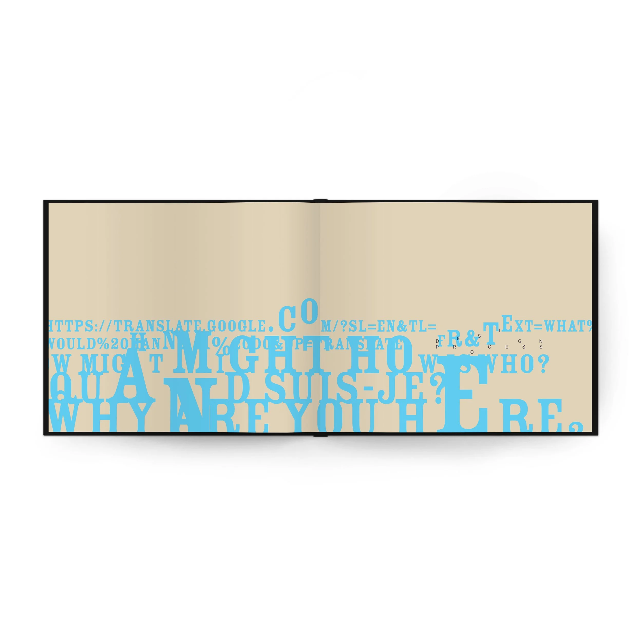
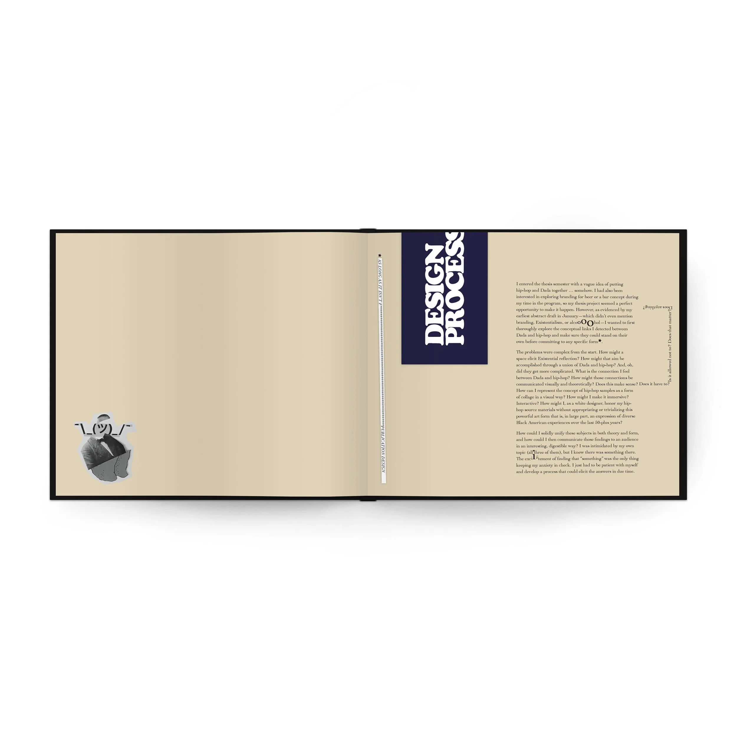
Created for my master’s thesis in MICA’s GDMA program, DABAR is a speakeasy concept whose experiential and visual design live at the unexpected intersection of Dada and hip-hop. Consisting of a visual identity, bar paraphernalia, and an accompanying book, DABAR is an exploration of wild typography from the Dadaists’ anti-art publications of the 1910s and from Buddy Esquire’s Letraset-and-Xeroxed hip-hop flyers of the early ‘80s, forcefully stitched together with the righteous thread of social justice.
STYLE
Based on the typography of Letraset-heavy Buddy Esquire flyers, various Dada periodicals, and ubiquitous fonts of Europe in general, I created an expansive style that was both flexible and appropriately disorienting for a freewheeling, improvised, maximalist brand like DABAR.
The color palette, ranging from bright pastels to deep neutrals, is informed by the cheap paper stock used in Esquire’s flyers and in Dada’s publishing.
Ornamental elements draw from the variety of stars and hand-drawn text-block outlines in the Esquire flyers as well as the rhombus shapes and pointed-hand manicules popular in Dada-era typography.
I further expanded the manicules into a set of contemporary interpretations that lean into Dadaist semantic ambiguity: two fingers up, a middle finger, and a thumb-and index pointing hand, each symbol only as offensive or benign as the context in which it’s used.
THESIS BOOK EXCERPTS


